How to Match Wall Art With Your Interior Design
Art should converse with architecture and furniture, not fight them. Note whether your space leans warm (oak, brass, cream) or cool (white oak, black metal, gray plaster). Choose watercolor cityscapes whose skies and stone tones sit in the same family.
Let the room set the constraints
You can still introduce a contrasting accent — a sunset Paris print in a mostly cool room — if nearby textiles pick up a hint of that warmth.
Modern and minimal rooms
Favor clean silhouettes, generous negative space in the composition, and slim black or natural frames. One oversized print often looks more modern than many small ones.
Keep mats simple. Let the watercolor’s soft edges supply the organic contrast against sharp furniture lines.
Traditional, transitional, and cozy spaces
Warmer woods, soft off-white mats, and slightly deeper frame profiles complement classic sofas and patterned rugs. Cityscapes with golden-hour light or historic landmarks (bridges, domes, boulevards) feel at home here.
Gallery walls with consistent framing can bridge transitional spaces that mix old and new furniture.
Repeat, do not clone
Repeating a color or material once or twice is harmony; matching every pillow to every pigment is costume. Pull a secondary color from the print into a small object — a ceramic, a book spine, a throw — and leave the rest of the room free.
Featured prints
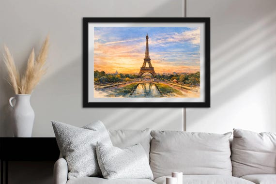
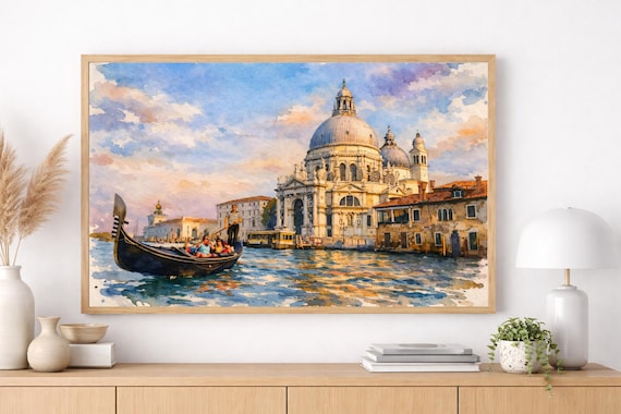
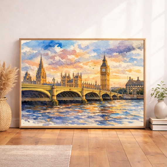
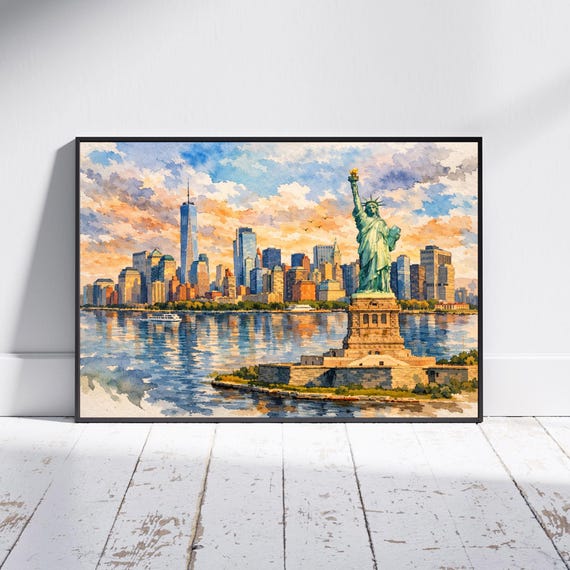
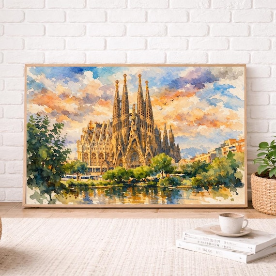
Shop related
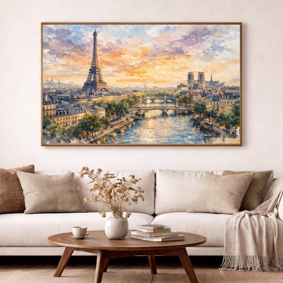
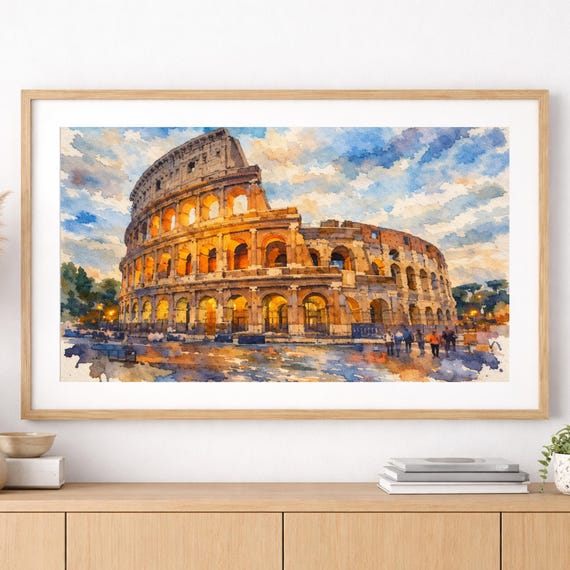

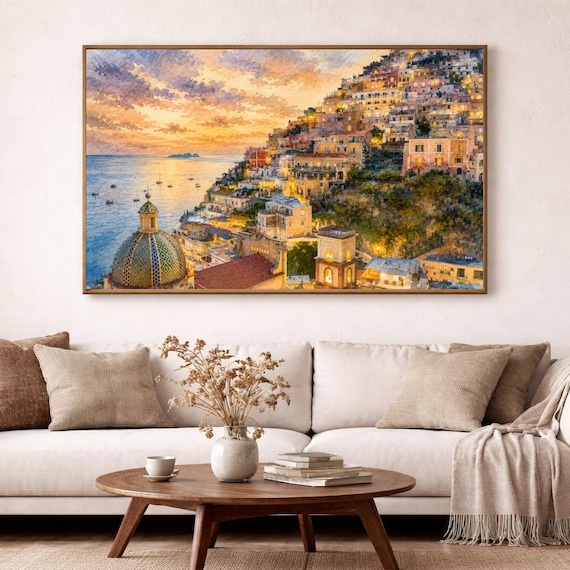
Quick answers
- Can watercolor art work in an industrial loft?
- Yes. Soft watercolor against brick and steel creates welcome contrast. Use simple metal or black frames so the pairing feels intentional.
- What if my furniture is very colorful?
- Choose cityscapes with quieter skies and let furniture remain the loudest color note — or pick one print that includes a related accent hue.